Accessibility Considerations: How I make Alpha Forward Accessible
- Madison Doucette
- Nov 30, 2020
- 1 min read
Updated: Feb 22, 2021
Tasked with taking a website or application more accessible, I chose to explore an online shopping platform praised by it's clientele for it's imagery, something I myself have found memorable and appealing about the brand. Yet, the same aesthetic that garners it praise makes the site very inaccessible, according to various standards by the ADA.
My corrections to the site are documented below.
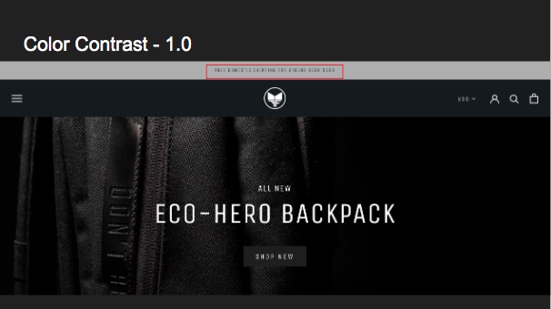
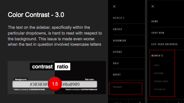
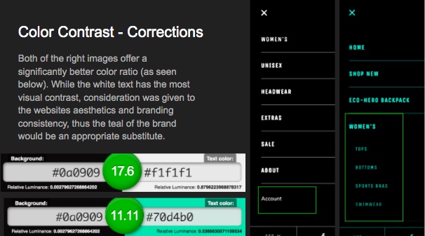
Color Contrast
The first corrections were made to color contrast. As one can notice in the first 2 images, the contrast between background and text color is low, quantified to a ratio of 1.5. With slight adjustment, two alternate colorways both show an increase of over 10x better contrast, as seen in image 3.


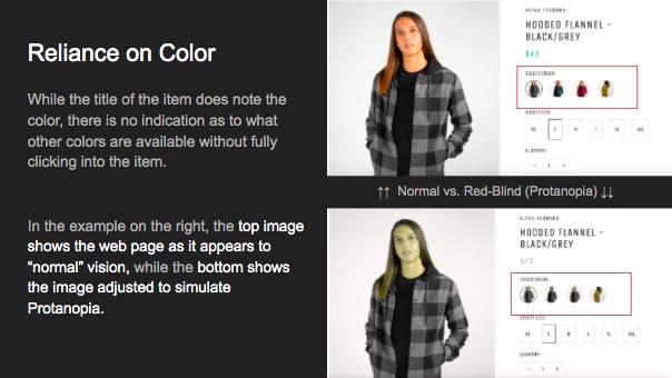
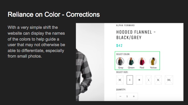
Reliance on Color
As seen with the lack of description below the color selection feature to purchasing, the platform relies on the ability to see and differentiate color rather than providing multiple alternatives. To increase accessibility, the simple addition of a verbal label would help both those with color blindness, such as protanopia (as simulated below), or other sight related problems that may prompt the use of a site-reading software.


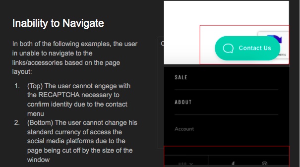
Inability to Navigate
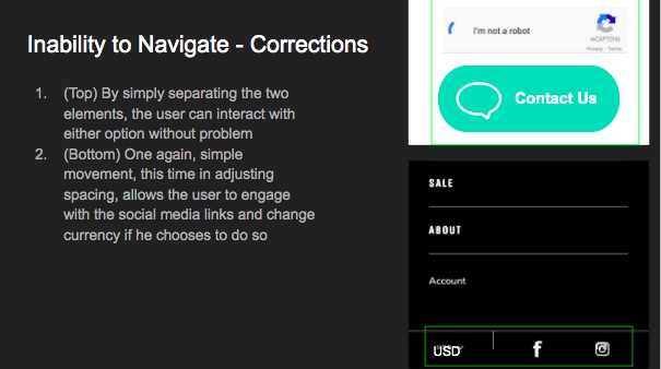
While less severe than the previous examples with respect to the ADA, the final problem is frustrating to some, but to those who have problems with fine motor skills, the fine placement of the cursor mandated by the design proves impossible. The solution: a slight vertical shift that does no more than slightly decrease negative space but increases usability and accessibility drastically.


Comments